Worst self-published print book ever?
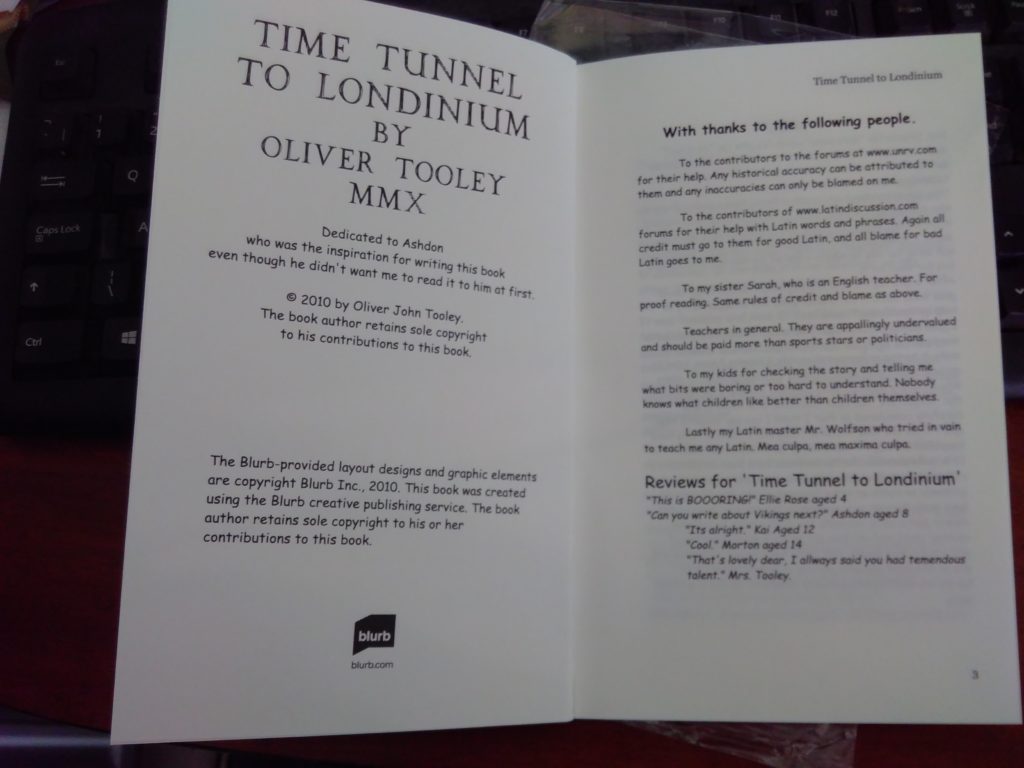
The first book I began to write was “Children of the Wise Oak” but that stalled because I decided the original idea was terrible and I didn’t know how to proceed with it. The very first book I finished was a short story called “Time Tunnel to Londinium.”
I had no intention of trying to find a traditional publisher. Not because I didn’t want one, but because I felt that the entire industry is geared up to a “rejection” process rather than a “selection” process. I knew my shallow ego could not face rejection. I also felt that publishers were only interested in books by celebrities. While this may not be strictly true, it was enough to put me off.
But at that time, I came across a company called “Blurb” who are still going. They offer a self-publishing service for any number of books from a single copy to hundreds. They have a variety of options including their own software for creating the book interiors and covers, and a huge range of book sizes and formats. They even offer hardcover options.
What they don’t do, at least not for free, is tell you how to make sure your books looks professional. Nobody does, and boy is it easy to make mistakes. See here for help to avoid some of those mistakes.
- Book size
- Paper choice
- Font
- Font size
- Gutters
- Justifying
- Line spacing
- Cover design
- Blurb
- Editing
- ?????
There are so many little things to consider, and if you get any one of them wrong it sends a signal to prospective readers “this is an amateur book”. They might not even know why!
So how bad was my first effort? – Pretty terrible, but don’t take my word for it; I still have plenty of copies left.
 Let’s start with the front cover. Well ok, it could have been worse, but I mocked it up using images from the internet without bothering to check if they were available for reuse. (This is a serious mistake and nobody should ever do this, although I fear huge numbers of people do) If you cannot find an image you like which is officially available for commercial reuse and modification then you should not touch it with a barge pole. Take a photograph yourself, get a photographer, or artist, or a professional cover designer to help you. Rather use a WYSIWYG cover designer like on Amazon Kindle than leave yourself open to a copyright suit in the future.
Then there is the size issue. These books were a standard size offered by Blurb, but paperbacks in the USA are a different set of sizes from those in the UK. Almost all my market is the UK so I should have used a standard UK paperback size. That size is 198mm x 129mm (I just typed that from memory and then double checked) (It is actually 7.8 inches by 5 inches but who uses inches these days?)
Let’s just reiterate that
UK standard paperback size for a novel is 198mm x 129mm
If that is the only size you know you will be fine for some time to come.
So what about the interior? How badly did I mess up that can of worms? Well…
Have you spotted it yet?
Comic Sans!
That’s not all, but it is enough. I wanted to make it easy to read for young readers. I personally dislike double story “a” even now. Nobody writes an “a” like it is printed. But that is no excuse for using Comic Sans in any book aimed at children over the age of about five.
Now it turns out I was worrying over nothing much. Most junior school children can comprehend the difference between a double-decker serif “a” and the letter “a” they write with their pen or pencil. It might be an issue for Aspies like me who spent ages fretting about this little detail but not for “normal” children. (there’s a whole world of things you can do to help those with dyslexia, but that’s an article in itself)
I now tend to use Century Schoolbook 12 or 14 point (the larger for younger readers 6-18 smaller for 8-10) and Garamond 11 point for YA.
I also got it printed on white paper because I naively thought that looked more expensive. Alas it also makes it less readable, especially to dyslexics apparently.
Blurb saved me from making some of the other classic mistakes, for example page numbering and titles in headers being incorrectly formatted, not having gutters (the words disappear into the book spine without them) and mirrored margins; but it did allow me to use “left justified” instead of “both justified”. In books you do not want a ragged margin on either side of the page.
So I had one hundred copies of this book printed (the more you print the cheaper it is per book) I sent out copies to people who bought them, but now I refuse to sell any more because I know how awful they are. I keep them as a warning to myself and others of the perils of not doing proper research.


